Posted 16th May 2021 •
By Design Bundles
The Font Bundles and Design Bundles shop application team has asked me to write up a blog post with some advice and feedback for folks applying to open new shops in the marketplaces. We’ve discussed a lot of the most common problems they see in new applications, and I’ve combined those with a lot of issues I see in shops across the web. Let’s talk about them!
(Want to go straight to a specific section of this post? Here are shortcuts to information about: the application form itself, portfolio links, overall presentation (images & descriptions), intellectual property issues, and product quality.)
THE APPLICATION FORM
First, let’s take a look specifically at the Font Bundles/Design Bundles (shortened to FB/DB from here on out) application form and discuss some of the issues the team sees the most:

The very first thing you’ll fill out is your store name and URL.
A: The “Your Store Name” spot is for—you guessed it—the name of your store. For example, mine is“Missy Meyer Fonts.”If you do business just as your name, this could be as simple as “Jane Doe” or “Jane Doe Designs.”If you do business under a company name, this could be “Example Creative Co.” or “Sample Designs”.Be sure to include necessary spaces and capitalization here; this is how you'd show your store name on your business card, or the window or awning of a physical shop!
B: The “Your Store URL” field determines the link to your shop. When you type in your store name in field A, the system will auto-populate your URL here in field B. But you can change it!It will add dashes where you have spaces in your Store Name, so a store named “Example Creative Co” will get a default URL of “example-creative-co”.You could change this to “examplecreative” in order to match your social media handles or the URL you use across the internet. Important: make sure this is correct now, because it can’t be changed later!
Here’s where those two fields appear on my font shop:

My Store Name [A] is Missy Meyer Fonts, but my URL [B] is “geekmissy,” because that’s what I use for most of my social media links and sites.
Be sure you aren’t pasting website links into either of these fields! The team reports having seen more than one application with a URL like “https-wwwetsycom-shop-storename.”

Next up is the area where you tell the shops team about yourself and your work! This information is only for the eyes of the application team; unlike your store name and URL, none of this will appear to the public.
C: The drop-down menu has options for several sites you can use for your portfolio. It includes portfolio sites like Behance, vetted marketplaces like Creative Market, open marketplaces like Etsy, and you also have the option to include your own website or a link to another marketplace not already included in the list. The more portfolio links you include, the better! Just be sure that the portfolios/shops you’re presenting show the same work that you’d be selling at FB/DB. (I have a whole “Portfolio Links” section coming up below with more details!)
D: You’ll also want to include a link to either your Facebook profile or Instagram page. Be sure that you’re using your personal profile link, not a business page; the team wants to know who you are!(Remember, this information is for internal use only; the public won’t see it.)
E: Here’s where you’ll tell the team about you: your experience, your style, and your story. Don’t just copy and paste a bio from another site; this is your spot to give the team any information that will inform them about you and the quality of your work. Here are some examples:
BAD: I make fonts and sell them.
MEH: I’ve sold fonts for 5 years on a few marketplaces, would like to expand to Font Bundles too.
GREAT: Hi! I’m Missy Meyer, based out of Phoenix, Arizona, USA. I’ve been a graphic designer for over 20 years, specializing in font design for the last 5 years. I work in Font Creator 12 for PC (with assists from Procreate for iOS and Adobe Illustrator), and I specialize in smooth, clean fonts built for cutting machines and crafters. You’ll see that my fonts are all OpenType coded, with all alternates and ligatures mapped to the PUA.

This contact information area is pretty self-explanatory. Remember, this information goes on your user account but is NOT available to the public in any way. It’s for internal use only.
You may or may not see this next part, Step 3, depending on whether or not you’re already logged in to a user account. If you aren’t logged in, you’ll get this step to create a new user account that the store will be connected to.

G: The first name/last name area can trip up some applicants. You’ll want to put your actual human name in these fields, NOT your business name. The team needs to know who you are! (And if you’re already logged in to an existing user account, make sure you have your human name in the first name/last name fields on that account before filling out the application form.)
H: I know, I know. You’re tempted to just check this box and move on. I strongly recommend reading the terms and conditions (not just for this site; for any site that asks you to read them).
After filling out the form and clicking that final "Complete Signup" button, you’ll get one more pop-up:

This is a reminder that you need to upload at least one product to the marketplace in order to complete the application. You don’t have to upload right away; you can wait until you’re ready! Important: until that first listing is uploaded, the incomplete application is in limbo, and can’t be looked at by the shops team. The application will only move into the assessment queue when that first listing gets uploaded.
PORTFOLIO LINKS
Let’s talk about item C from the application form: your portfolio links. These links are your opportunity to show the team your body of work. Here are some key pieces of advice:
SHOW HOW YOU SELL: Your portfolio should show the work you’ll be selling at FB/DB, presented as it would be for sale in that marketplace. That means you’ll want a main promotional image; secondary images showing your products as they would be used (such as sample phrases for a font, or mocked up products for a design); a full description; and an informative title.
PLENTY OF WORK: The portfolio should contain a minimum of 6 pieces of work, but I’d recommend at least 10-12, so the team can get a good idea of your overall style. Make sure those pieces show variety; six designs of a near-identical phrase that have one word swapped out will be considered one design.
SOCIALS? NO-CIALS!: Social media pages, like your Facebook, Instagram, or Twitter, cannot be used as a portfolio; they don’t contain all of the elements the team would need to see – images, description, title.
CLOUD FOLDER? CLOUD NO-LDER!: Similarly, the team can’t accept a link to a folder in a cloud storage site like Google Drive or Dropbox. It’s impossible to show your presentation and include all of the relevant elements.
MERCH SHOP? MERCH NHO-P!: (Sorry, my joke got stretched a little thin.) The team also can’t accept a link to a store selling physical merchandise, whether that’s a t-shirt shop at Etsy or a print-on-demand site like RedBubble. They need to see the presentation for your digital designs, not for physical goods.
And I’ve said it before, but I’ll say it again: any links you include should reflect the products you’d be selling in your shop.If you link to a marketplace shop full of watercolor illustrations, but you upload text cut files to your application, the team won’t know what you’d actually be selling. It's OK to have a variety of products! Just make sure both your portfolio and your uploaded items represent that variety.
PRESENTATION
Now we’re getting into more general advice that can apply to shops across many marketplaces. Most of these points will help not just with FB/DB, but will help improve your shops, portfolios, and sales across the internet.
In general, the items at your portfolio or marketplace shop links should be attractive, consistently presented, with no distracting or mis-sized elements. I'll break these down into two sections: images and descriptions.
IMAGES
Each marketplace has its own image formatting; at FB/DB, the required size is a 3:2 ratio landscape image.

Some marketplaces prefer a wider rectangle or a square, and Etsy’s preferred image format is a unique 5:4 landscape rectangle. Make sure that when you’re uploading a listing to your FB/DB application, your images fit 3:2; and when you post listings at other marketplaces, be sure you’re using their preferred format. Too many Etsy shops have a page full of designs with chopped-off tops, bottoms, and sides due to the wrong image size!
Now, let’s look at some examples of promotional images that are and aren’t successful. These are all for a cut file design (that I made in a couple of minutes, don't judge), and represent elements from promotional photos I've actually seen:

1: I’ll start easy. This one doesn’t seem so bad; the design is in plain black on a solid white background! But it’s actually full of problems. First off, it doesn’t have a logo or branding from the maker. Once that image gets out onto the internet, nobody will know how to find you or your work. Second, solid black on solid white has become (whether we like it or not) the universal sign for “free clipart.”People who are unscrupulous (or just don’t know any better) will grab these images, trace them in their software, and use them with abandon. Third, there’s no personality! It’s hard to tell anything about you or your style in this presentation.
2: This one has perhaps a little bit TOO much personality. Issues here are: a dark background with a dark design, making it difficult to see; a heavy watermark over the design, also making it difficult to see; and cut off sides of the design, indicating that the original image isn’t formatted to the right size, which also makes things difficult to see.I tried to cram a lot of “don’t” items in here, and I apologize to your eyes. ?
3: Unless you’re a professional product photographer as well as a designer, I strongly recommend that you avoid taking snapshots of physical objects to show off your digital designs. Most home photography will have lighting, angle, and layout issues. If you prefer to show your designs in action in your main promotional image, you can absolutely use professionally-made mockups; many designers have great success with them!
4: Here’s a sample I put together that has most of the elements the FB/DB team is looking for. The image has a subtle but clean background, a spot with the shop branding/logo, file format information so a customer can see that information without having to go into the listing, and the design itself is presented in a color scheme that catches the eye without it being jarring. (I recommend staying away from fully saturated primary colors.)This is a pretty generic presentation; your branding, background, and color choices can (and should) really show off your style!
If you have a template, it’s easy to just plug in your design, while all other elements remain the same. It’s a quick and easy way to get a consistent, professional look throughout your shop or portfolio!

Font promotional images don’t need to be as consistent, but they should be attractive, interesting, and informative. Here are two examples:
1: This has just the font name, surrounded by very common text that doesn’t tell the customer very much. The background is relatively plain, and the image doesn’t draw the eye. I strongly advise you to not use the word “introducing” in your promo image, unless you plan on revising the image in a few weeks.(And yes, I’ve done it in the past. We all do. Learn from my mistakes!)It makes things look awkward and out-of-touch when a font has been around for a few years and is still being introduced.
2: Here’s the same font (the actual font is Mystical Woods, by the way), but with a more dynamic (free!) stock image behind the text.I’ve also included more information about the font on that first image, so the customer doesn’t need to click through into the listing in order to get some basic information. Right up front, I’ve let the customer know the font style, maker, file types included, and a clue about the bonus extras, all without taking up much more space than the generic text on image 1!
DESCRIPTIONS
That covers images, but what about descriptions? The team will look at those as well. Your product descriptions should be informative, clearly written, and contain all of the information a customer would want to know before buying.You shouldn't use lists of keywords; make it conversational. For items uploaded to FB/DB, descriptions should always be free of any licensing, terms of use, or other limiting languages. Here are some examples:
BAD: Christmas greeting, card, shirt, t-shirt, clothing, mug, glass, vinyl, holiday, winter, family, ornament SVG JPG PNG - For personal or small business use.
GOOD: This Christmas Greetings design has a vintage feel with some elegant flourishes, but the letters keep a more casual style that keeps things from becoming too formal. It’s great for a ton of projects – put it on your holiday cards, gifts like mugs and ornaments, or you could even cut it out of vinyl at a large size and stick it on a wall!
And don’t worry about ease of use – this design has been tested in both Cricut Design Space and Silhouette Studio, and it cuts like a dream in both. Plus with SVG, PNG, DXF, and EPS file formats included, you’ll have options no matter which design program you choose to use.
Your download contains the Christmas Greeting graphic in:
- SVG vector file
- DXF vector file
- EPS vector file (Adobe Illustrator CS4+)
- PNG with transparent background (300 dpi, 3600x3600 px/12x12 inches)
Keep it friendly and chatty, but get the information in there that a customer needs to know. I've seen too many PNG images that only say“300 dpi” but don't actually include the image size, and it turns out to be something like 600x600 pixels, which would print at 2 inches square.
INTELLECTUAL PROPERTY
In both your portfolio and any work that you upload with your application, be sure to show that you have a firm knowledge of intellectual property rights. Make sure that your materials are free from copyright infringements, registered trademarks or trade dress, likenesses, logos, or any other material that falls under intellectual property protections.
Examples? Oh yeah, I have some!
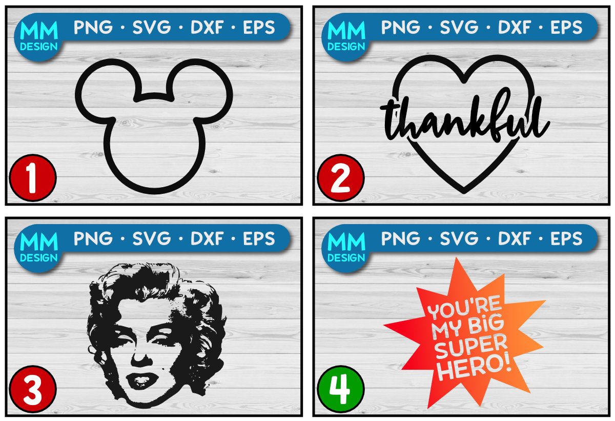
1: The classic Mickey Mouse silhouette is protected by copyright laws, and it’s also a registered trademark. Any characters from pop culture, whether they’re Marvel superheroes or Minions, and whether they’re modified versions of someone else’s artwork or original fan art, are infringing on the intellectual property of the original creators. Any work made by others can fall under copyright protection as well; if a font is used to create a PNG alphabet set or someone else’s clipart is used in a larger design, the new work may be infringing.
2: This one often surprises people – did you know that many simple words and phrases are registered trademarks? For example, THANKFUL here is registered as a word mark, with no regard to style, font, or color. That means no matter what font you use, no matter how you display it, if you’re using the word THANKFUL all by itself, you’re infringing on a registered trademark. If you really want your socks knocked off, I keep a spreadsheet of registered trademarks for clothing. It's a real eye-opener!
3: Marilyn Monroe here is an example of a likeness issue. If you haven’t purchased a specific license or release to use a person’s likeness in a design, you’re most likely violating their IP rights. (Side note: if you’re selling photos of people, such as shirt mockups being worn by individuals, make sure that you have signed model releases from those people that will allow you to sell their likeness!)
4: Here’s a quick example I threw together of a non-infringing design. I made up the phrase and checked it against trademark registrations. I created the background graphic from two overlapping star shapes drawn in my vector program. And the font is fully licensed for commercial use.No copyright, trademark, likeness, or other intellectual property issues!
PRODUCT QUALITY & CONTENT
How you present your work is important, don’t get me wrong. But the most important thing is the quality of your products; images and descriptions can always be refreshed, but if the products themselves aren’t built well, a store can’t succeed.
No matter what type of products you sell, they should always be tested in the software programs they’ll most likely be used with.If you haven’t checked cut files to make sure they’ll open in Cricut Design Space or Silhouette Studio, or if you haven’t tested fonts in those programs plus others like Adobe Photoshop or Microsoft Word, then your products aren’t yet ready to sell.
If your files are put into a ZIP folder, make sure you don’t have too many folder layers; don’t put ZIP folders inside of other ZIP folders, and ensure that your files are named well. (I can’t count the number of times I’ve opened a ZIP to find “1.jpg” and “2.jpg” and “3.jpg” in there. Don’t do that.)
Your designs should be properly sized for their intended use; if you’ve created a t-shirt design, be sure to make it at least 12x12 inches, although the print area on some shirts can be as large as 15x20 inches. (Yes, I’ve seen shirt designs at 6x6 inches or smaller.) (Oh, and you’re including the sizing information in your descriptions, right?)
Here are a few product-type-specific recommendations:
- For cut files, make sure that you’ve removed unnecessary nodes, have sharp corners, and have smooth lines and curves.
- For sublimation files, make sure your outlines are clean, and there are no eraser artifacts left behind. Make sure your PNGs are large enough for shirts, posters, or other intended uses.
- For PNG illustrations, your outlines should be clean, with no fuzzy halo where a background was not fully erased. And if you did erase a background, be sure to check for small artifacts left behind!
- For fonts, be sure you’ve included the full Basic Latin character set at the very minimum, your outlines are clean, all characters are correctly mapped, and you’ve included kerning (on every font) and OpenType coding (on fonts with alternates, ligatures, or other extras).Also, make sure you’re choosing font names that nobody else has used before!
I’ve included “content” in this section as well; sometimes, the kinds of designs you want to make and sell just don’t mesh well with FB/DB's community standards. Design Bundles is stricter than many other marketplaces and aims to be family-friendly. If your portfolio is beautifully presented and full of well-made designs, but those designs are all about drugs, sex, violence, and/or profanity, the team would still decline the application.
It really all boils down to clean, well-presented, original, and creative work. The FB/DB shops team can’t give individualized feedback, but these points cover probably 95% of the reasons shop applications are declined. Hopefully, this article can help you spot any issues before you apply, and help improve your chances of having a shop application approved!
~Missy
