How to Do Calligraphy in Procreate
Learn how to do Calligraphy in Procreate with this step by step tutorial.
Calligraphy is known as the art of writing. Used in logos, certificates, font design and more, it is also a favorite for crafting projects. Procreate offers a lot of features that are perfect for calligraphy and lettering.
In this tutorial, we will explore the settings, techniques, and brushes you can use to create beautiful writing in Procreate.

Adjustments to Make in Procreate
One thing that needs to be considered before starting is that, even if you are familiar with the traditional way of doing calligraphy, the iPad and Procreate brushes behave differently than pen and paper.
To tackle that difference and set Procreate’s digital environment to be as similar to analog calligraphy as possible, we need to do the following: use calligraphy brushes, use lettering grids, adjust Streamline, and adjust the Pressure Curve.
Use Calligraphy Brushes
There are tons of great lettering artists out there making realistic calligraphy brushes for Procreate. You'll want to look for brushes that have pressure sensitivity that will allow you to use varied line thicknesses.
There are many calligraphy brushes available, some of them already included in Procreate. You can use these brushes as a starting point. You can also adjust the settings that work best for you and save as a new brush.
In this tutorial, we will use some brushes from this brush kit. However, you can use any Procreate lettering brushes from Design Bundles.

We have already installed our brushes into Procreate but here is a guide on installing and organizing Procreate Brushes if you need some help with that.
Use Grids to Aid You While Writing
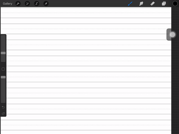
Later in the tutorial we will also use some calligraphy grids to aid us with the proper stroke and letter formation. To import the grids, head to the Procreate Gallery and click the Import button on the top right corner. Find the file you want to use and select it. Now it should show in the gallery.

Adjust the Brush Streamline
The most important setting for a well-adjusted calligraphy brush is the Streamline. Streamline decreases shaky lines and stabilizes movements.
A percentage 70-100% is usually preferred, but you can play around to see what you like best. For a more in-depth view of this feature, you can check out our tutorial on how to make lines smoother in Procreate.

Adjust the Pressure Curve
The Streamline adjustment works along with the Pressure Curve. The Pressure Curve determines how the Apple Pencil reacts to the pressure applied while writing or drawing.
To adjust the pressure curve, tap on the Actions menu (small wrench icon) on the top left of your screen then select Edit Pressure Curve.

We have a full in depth tutorial on using and adjusting the Pressure Curve in Procreate. But to give a quick example, if you pull the curve up, your lines will be thicker without the need to apply too much pressure with your Apple Pencil.

If you pull the line down, the lines will be thinner with the same amount of pressure.

Knowing how to set up the brush is key to creating a more harmonious calligraphic writing. The correct settings for Procreate with the aid of guides helps to achieve the ideal proportions. Without this, the transitions from thin to thick strokes will not be as fluid as you want.
Basic Calligraphy Strokes and Guidelines
While the tools are important, you also need to have the correct technique. Calligraphy needs a slower pace than normally used in writing. This is because you need to consider things like the thickness of the stroke. The direction you move in as well as the pressure changes how the stroke appears.
After setting up everything correctly, it’s time to move on to the actual writing. We will cover the essential or basic strokes that you will need to practice and/or create calligraphy in procreate.
Guidelines and letter formation
If you are using a grid or guideline, we will go over the meaning of each line.

The main body of the letters will begin from the baseline to the x line (x-height). This is the height of almost all the lowercase letters.
Some letters that contain an ascending loop, like the h, will extend to the Ascender line. Others that contain a descending loop, like the j, will extend to the Descender line.
The Cap line is used for the uppercase and the lowercase letters. The components of these letters extend above the x line like the t or the d. The line can be placed at the same height as the Ascender line. It can also be at a slightly lower position depending on the preference or style you are using.

Upstrokes and Downstrokes
The basis of calligraphy is the thin upstrokes and thick downstrokes. These two concepts must be kept in mind while creating your letters.

Starting with the first stroke, apply little pressure while going up. Then, start increasing the pressure while curving the stroke and moving down. When moving up again, lighten the pressure.
Practice these strokes until you are comfortable with them. The idea is to get used to the movements and the amount of pressure needed to apply in each stroke.

Basic Shapes to Form Letters
There are mainly seven (or eight, depending on how you count them) basic shapes in calligraphy. Every lowercase letter is formed by one of these basic shapes or by the combination of some of them.
The upstroke and/or downstroke, the overturn, the underturn, the compound curve, the oval and the ascending and descending loop.

Upstrokes and Downstrokes: Thin lines use a minimum amount of pressure while thick lines have a larger amount of pressure applied. We use it in some letters like the lowercase i, l, t and f.
Overturn Stroke: This a curved stroke that starts from the baseline with light pressure. It then curves when reaching the x line and goes down with heavy pressure. We use it in some letters like the lowercase m, n, h, etc.
Underturn Stroke: A curved stroke that starts from the x line with strong pressure. This then curves when reaching the baseline and goes up with light pressure. We use it in some letters like the lowercase u, y, etc.
Oval: For this one, you start with an upstroke, positioned on the right side of the oval and slightly up from the center (x line). With a circular movement, transition it into a downstroke then bring it up again to reach the starting points. This stroke is present in many characters like the lowercase o, a, c, e, etc.
Compound Curve: The compound curve is a combination of the overturn and underturn strokes. It is mainly used as an exit stroke. You can use it as is or stop halfway up without reaching the baseline or the ascender line.
Ascending Loop: It occurs on the portions of the characters that extend all the way up to the ascender line. You start with an upstroke curving up from the x line. When it reaches the ascender line, it comes down with a downstroke to the baseline. This stroke is present in many characters like the lowercase d, h, l, etc.
Descending Loop: We use this stroke on the portions of the characters that extend all the way down to the descender line. You start with a downstroke curving down from the x line. When it reaches the descender line, it goes up with an upstroke to the baseline. This stroke is present in many characters like the lowercase j, f, g, etc.
As mentioned before, some letters are a combination of various strokes. The f, for example, is formed by an ascending and a descending loop.
Other letters are formed with variations of the main strokes, like the x, s, z, v and w. Sometimes, we use a straight line placed diagonally, as with the x, for example.
The uppercase letters are a bit more complex and will require a more in depth look. You still can use all the knowledge acquired here to create them in their basic forms.
You are all set to use these tips and techniques for your calligraphy and lettering projects. Keep in mind that what is going to make your writing even better is to practice, practice, practice!
We have a great selection of Lettering Worksheets to help you practice your calligraphy. Next up, check out our tutorial on how to make Procreate brushes.


